All these terms make me want to bury my head in PH-balanced dirt
The problem
Partial shade? Dappled sun?
Many people search for ways to restore their local ecosystems, but get tangled up in the gardening lingo. Where can I find native plants? What’s a hardiness zone? Are my tulips invasive?
The response
Local Harvest is a conceptual e-commerce brand for native plant gardening The real product is information: your region, your soil, what's been growing there for centuries and why it matters. Get that content right, and the plants sell themselves.
In order to reach new and established gardeners in a competitive market, Local Harvest turned native planting into an educational and accessible experience by leveraging Wikipedia-style info with a geographic UI.
A few key insights…
People new to native gardening will need to be introduced to their local climate.
Knowing when or how to plant purchased seeds can be a mystery to many.
Gardening lingo can be overwhelming.
Ideation
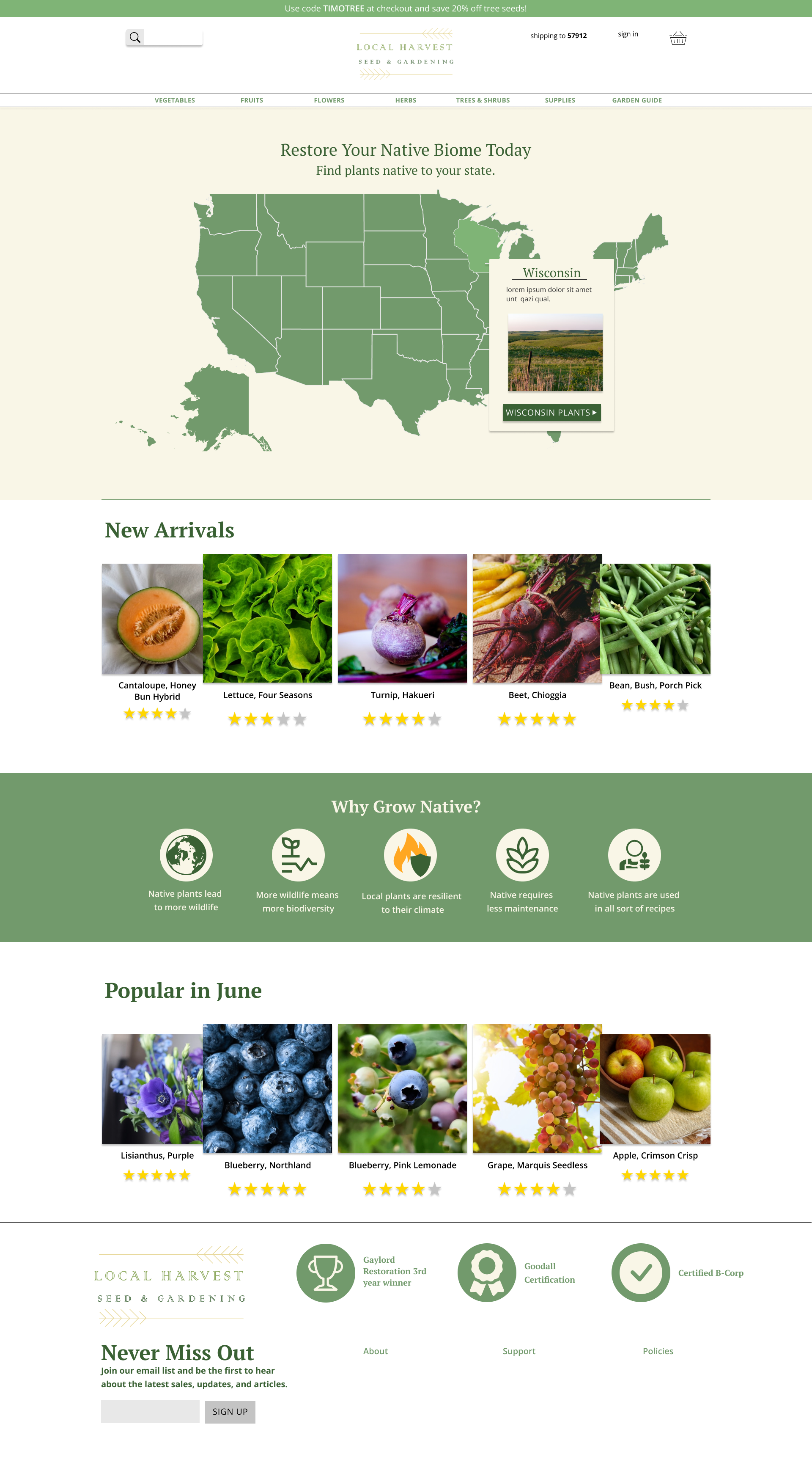
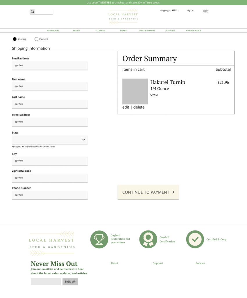
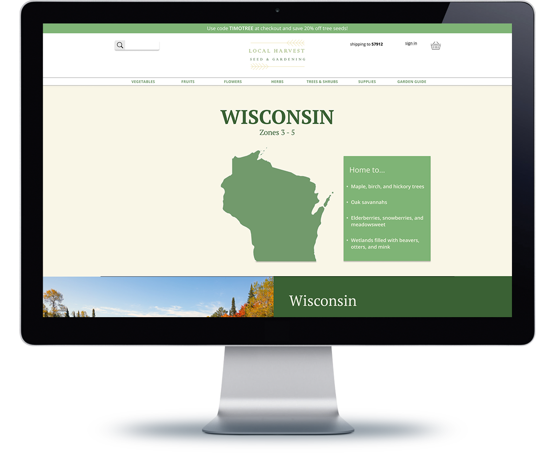
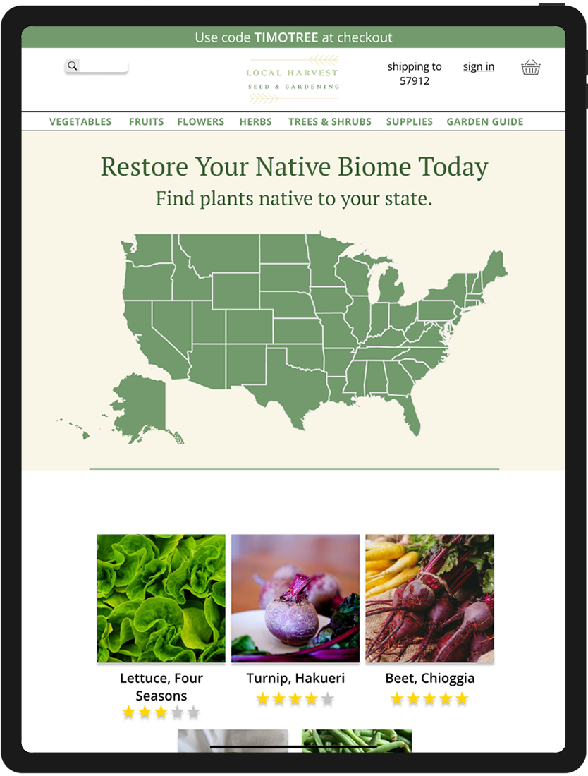
I settled on the idea of a region map present on the landing. This was the easiest way to solve sifting through 50 states while also getting the user more engaged with the process. I also made note of how extensive the product “Filter” and “Sort by” options would need to be. I turned to a multitude of already established gardening sites to find a smart sorting method.
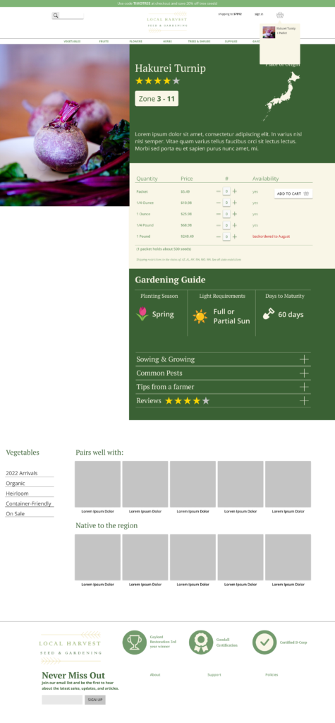
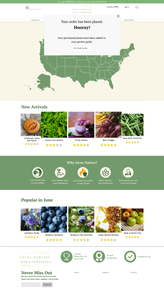
I also implemented a “Garden Guide” to the site. Once users complete their purchase, they will have their new plant type in their guide alongside simple care instructions. This guide also opts to explain growing zones to the user, bettering their understanding of their locale.
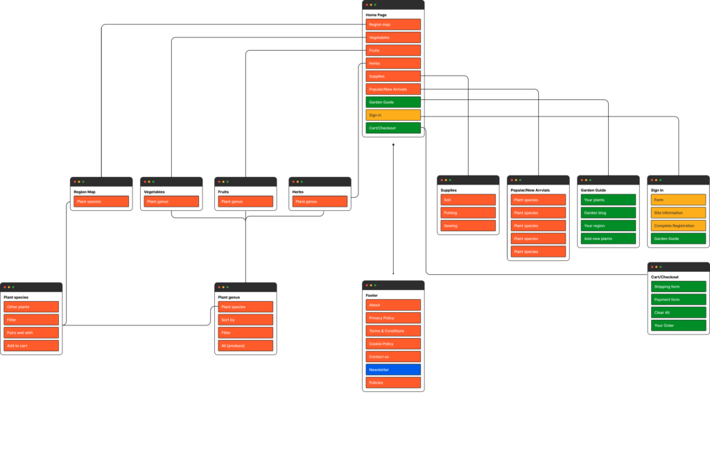
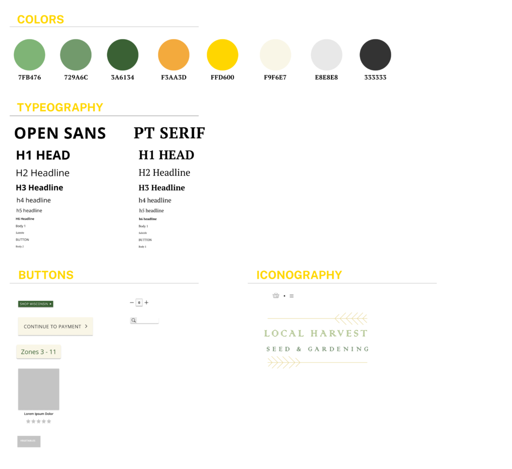
I used Figma to design an information architecture and style guide for Local Harvest.
Mockups
User Testing
I contacted a local nursery and asked if I could come in and ask customers to participate in a usability test, ending up with a pool size of 7, ages 21 to 63.
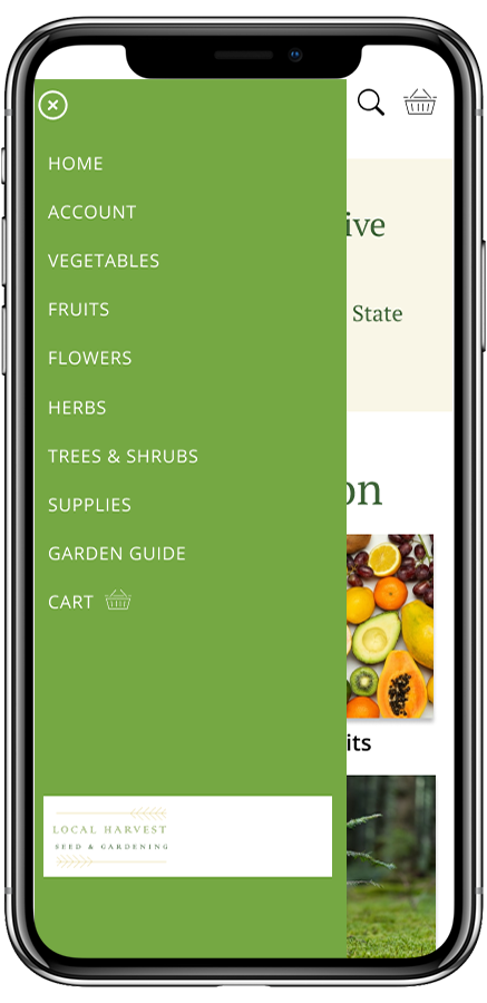
Users found page buttons well, but struggled to navigate to previous pages.
Users wanted more product line-ups on the home page.
“How do I get this to go away?” (Referring to map state selection pop-up)
Users wanted more information about their zone on selected plant page.
Results
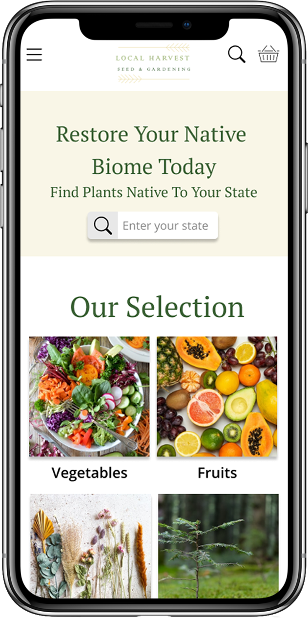
The second half of this project was the creation of mobile/responsive designs based off of the web design.
Using notes from the usability test, I implemented a hamburger menu to avoid difficulties maneuvering to previous pages.
The mobile section also replaces the map with a search bar, seeing as some states would be impossible to tap at such a size. Rhode Island-proof’d.
The state information page also includes historical information about the state, so that the user may become more eager and well-versed in their newfound passion.
What I Learned
This project helped me become more comfortable using components in Figma and Adobe XD. I am proud of the user journey that I was able to create for Local Harvest, and surprised myself by just how promising the brand idea became. If I could revisit this project, I would create a new logo, and orient Local Harvest to be an equally educational program as a product. I believe that Local Harvest’s education-first mission would end up developing a loyal, recurrent user base that would be eager to share not just a store, but the beginning of a new lifestyle and passion to new gardeners everywhere.
Other Projects