Wisconsin Solo & Small Firm Conference
The State Bar of Wisconsin hosts the WSSFC annually. A part of these conferences comes a “microsite” dedicated solely to the coordianation and advertising of the up-and-coming conference.
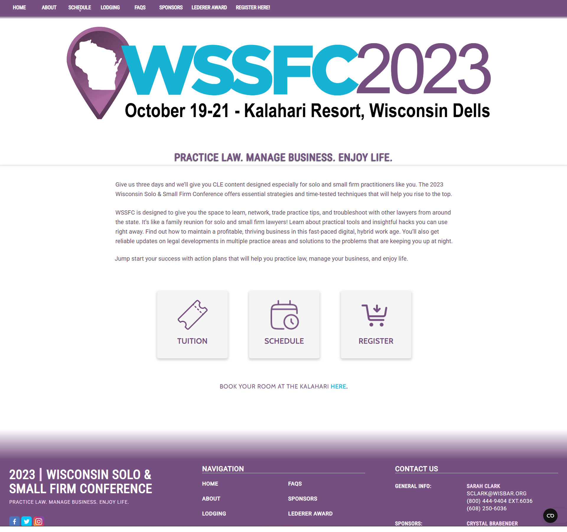
The 2023 website was the conference’s first site that I oversaw. I was given a list of assets and copy and asked to turn them into a website.
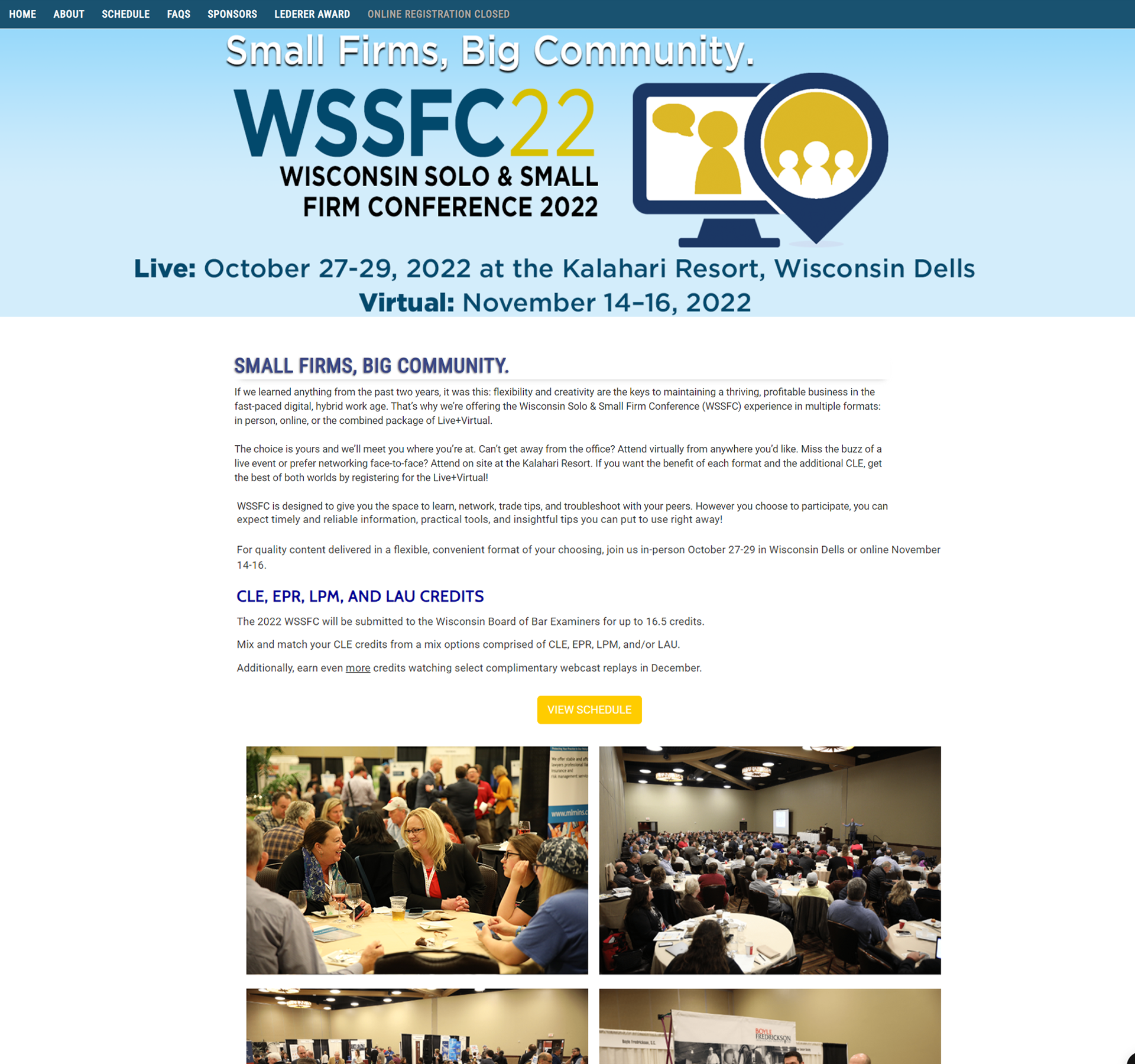
I quickly noticed an issue, though. The site’s header looked…
Like This.
I contacted the graphic design department. We discussed how colors appear differently on print versus on screens, and how this was a clear example. Furthermore, I explained how anyone with a form of color blindness may struggle to navigate the site if we stick with these colors. I emphasized the WCAG’s standard of a 4.5:1 color ratio, and worked out a web-friendly color palette.
From there, I noticed that we wouldn’t be using the any images on the homepage. I knew that a visually appealing component would still be a must-have, so I improvised.
I created new buttons that would take the user directly to the most visited pages: the schedule, the about page (nicknamed “Tuition” on the button), and a button to guide the user to the registration page.
By taking this approach, I was able to guide the user to the most important pages on the site. If their primary concern is the schedule, they’re there in a second. If it’s the price, they’re taken straight to that section.
The redesign has been a hit with the managers and conference-goers.