Local Harvest
(Re)Naturalizing Gardening
Content strategy / UI / Brand design
Overview
Cultivated landscapes have become so commonplace that the UN has promoted “rewilding” as a worldwide priority. As a naturalist I wanted to help, but I quickly overwhelmed myself all the wrong info. I read bios on Wikipedia, but growing information and the seed packets themselves were scattered across multiple marketplaces. Local Harvest became my conceptual e-commerce solution.
Problem
Learning about native, local plants is multiple searches or page-flips away for the gardeners, regardless of skill level. Sourcing these native seeds is a separate (and tedious) effort.
Scope
I created every element of Local Harvest—content design and graphics, to interface and info architecture—from scratch. This quickly became my passion project, and I didn’t let that blind me from my goals.
Goals
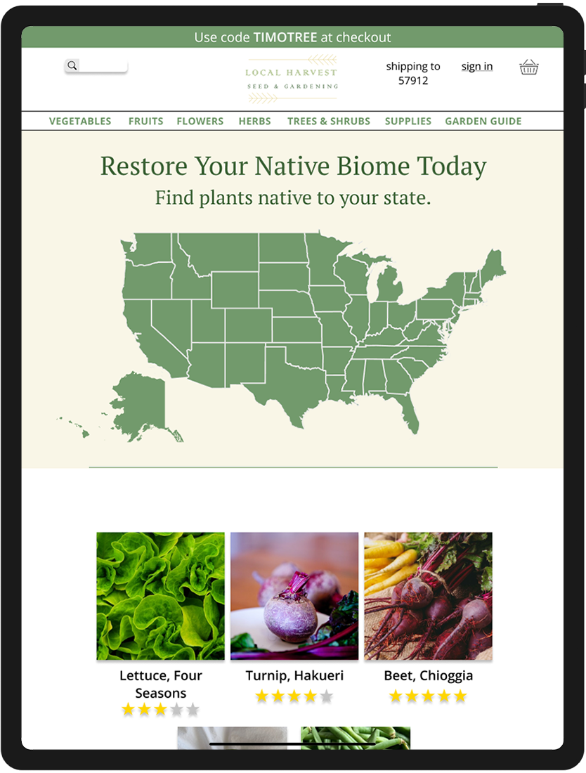
Create a landing page tailored for region-specific discovery
Inform users with rich history behind indigenous plants
Reassure new hobbyists that anyone can grow local
Help users cultivate new interests into actionable purchases
Research
A competitive analysis with the top seed marketplaces introduced me to confusing gardening lingo. I couldn’t define what a hardiness zone—or worse, dappled sunlight—was from the content available. While the terminology is invaluable to established growers, gardening read like an inaccessible language for beginners.
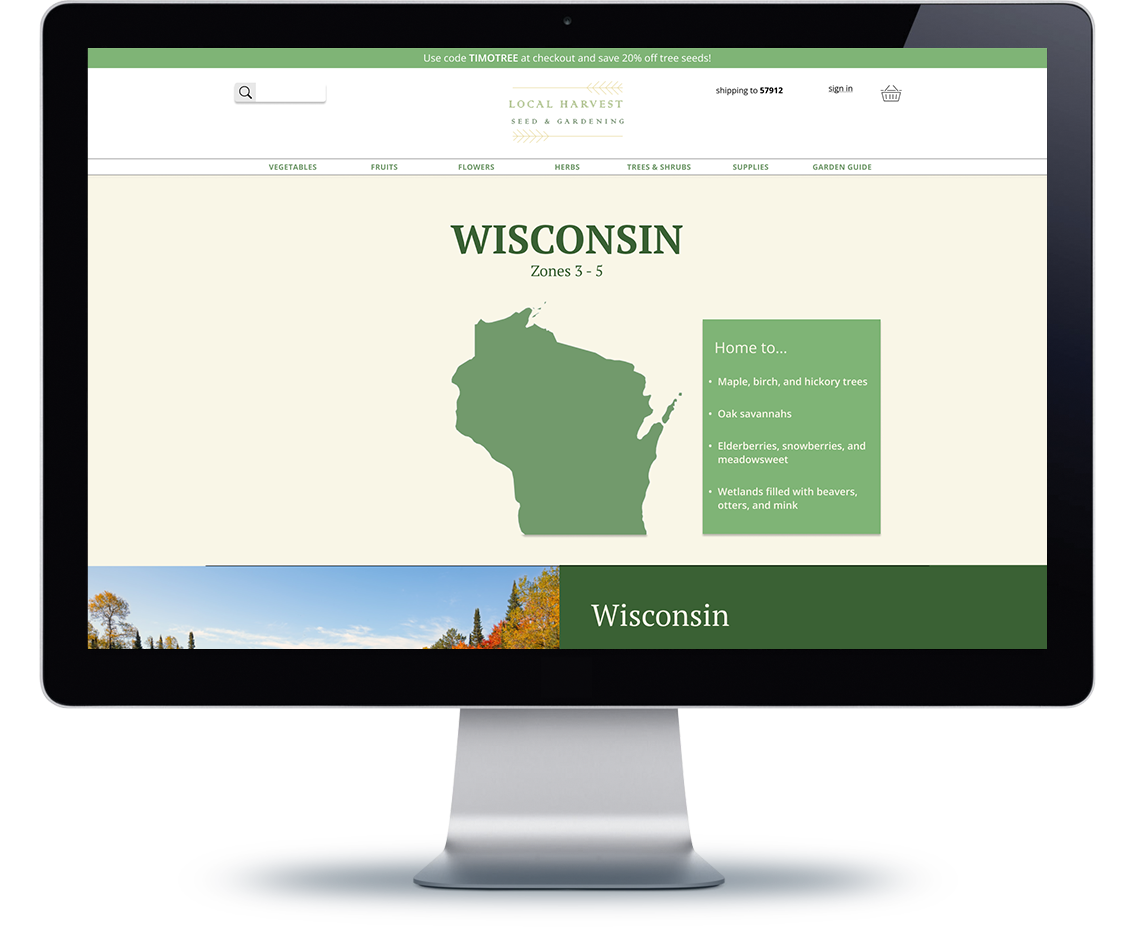
If I wanted users to identify themselves with their region’s biome, I’d need to lean on a visual heuristic. A few quick identifies for region, season, and and more could turn a confusing language into a series of breakthroughs.
Work
I settled on using a clickable region map on the landing page. This gave users quickly identify with their state, and the ability to explore any region at all. I then prioritized taxonomy, so that even the product filters could become an educational opportunity.
Surface-level bios gave users the chance to envision and connect with the region, without becoming overwhelming.
I also created a “Garden Guide”. Once users complete their purchase, they will unlock their plant in their guide and reveal simple care instructions. This turned an order history into a collectible game experience. Surface-level bios also gave users the chance to envision and connect with the region.
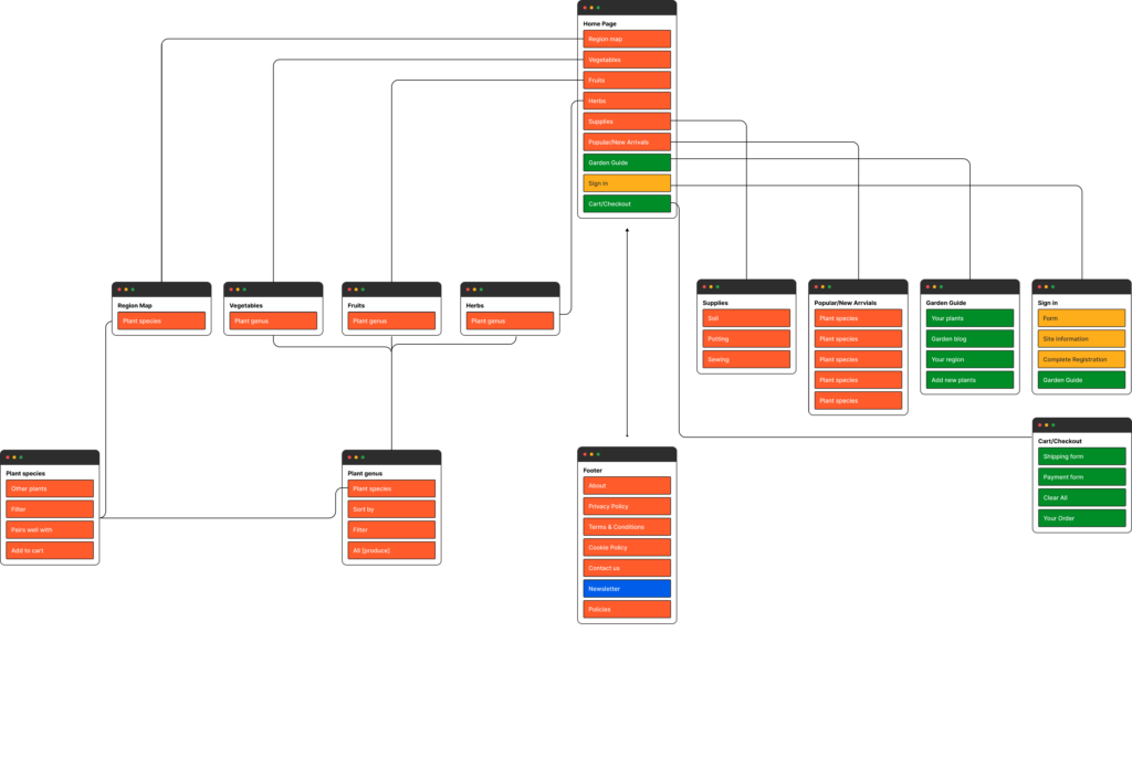
The site structured plants not by biological definitions but use-case. This warped “rewilding” back into regular old gardening. The only difference became the plants offered.
Reflections
Piecing together this brand concept brought me to discover the inaccessibility of gardening language, but also the shortcomings of simple iconography. So many attempts to clarify terms came in the form of three-fifths shaded suns, or growing zones depicted as colors. A simple description would’ve sufficed instead.
Visual heuristics like the region map are useful when already established. An established concept of three-fifths of a sun takes me to a world-ending winter.
How language design became the most important feature in a recovery app
Turning natural history into copy that turns ugly weeds into purchased seedsLegalese (Simplified)
Writing for lawyers doesn’t have to read like an ethics opinion—unless it’s an ethics opinion
When your error messages read like Parseltongue, you're designing for developers