State Bar of Wisconsin
No More Devspeak
UX Writing / Content Standards
Overview

Forms and tables across the State Bar of Wisconsin's web presence were communicating errors in the language of developers. This project produced a standards document covering error messages, link text, button labels, and form instructions, written so that both content editors and developers could apply it without ambiguity.
Problem
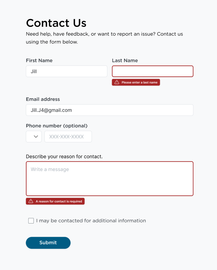
"Error, empty input" appeared across multiple forms. "Submission completed" appeared after users pulled their hair out when accented characters weren't accepted.
Developer-written microcopy is common at organizations where content and engineering don't share a standard. The developer ships the form and the error message is whatever the placeholder content was. These micro-frictions and tonal standards are how users weigh opinions on the organization.
Scope
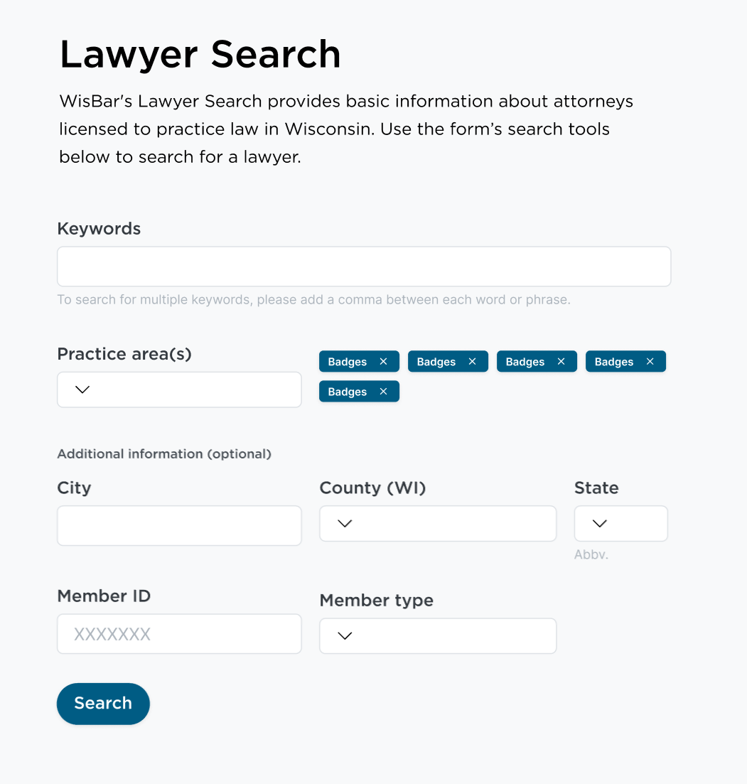
I audited form and table copy across the Bar's web properties, identified categories of failure, and produced a UX writing standards document. The document covered error messages, empty states, button labels, link text, and form field instructions—for both content editors and developers.
Goals
Replace developer-language forms with language that names the problem
Establish standards for link text, button copy, and form instructions
Meet WCAG requirements for error identification and suggestions
Test screen reader navigation for traps
Research
WCAG 2.1 success criteria 3.3.1 and 3.3.3 became the framework. If an error is detected and a correction can be suggested, it must be.
Nielsen Norman Group's research on form design shaped engineering standards: how to write labels so they don't disappear the moment a user starts typing, how to position error messages so they're tied to the correct field, and moments of ambiguous language that are perfect relationship-building opportunities. Meanwhile, links across the website provided little context where they'd lead, and buttons were entire sentences long.
Work
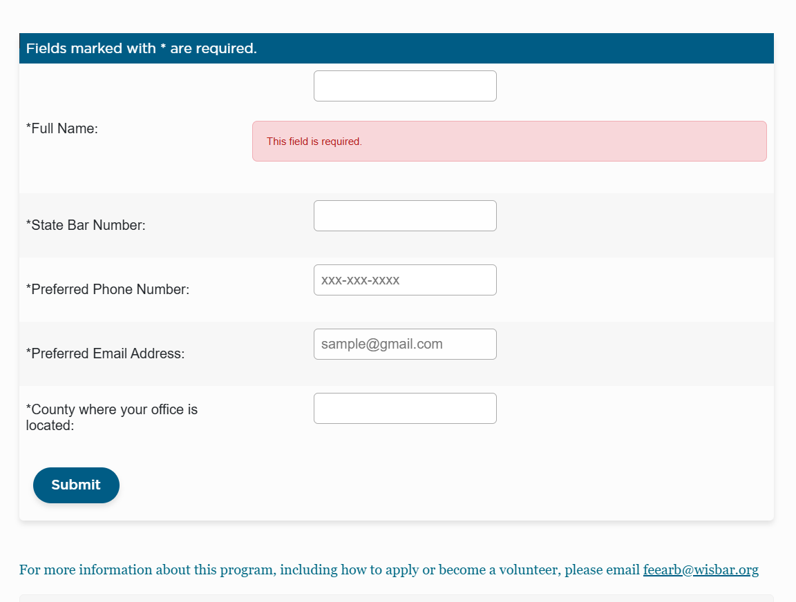
Error messages were the most common failure, though everything being *required was another redundancy to cut. Form labels floating on their own didn’t help with info digestion, either.
When almost field is required, I prefer to label the optional ones. Clear validation messages came easy, because I’d predefined a structure for writing them in a shared document. That way, developers and successors have one hub to guide language across the side.
Reflections
Accessible design is universal design. WCAG produced better UX, because a message that names a field and tells a user how to fix it is more useful for every user.
"Error, empty input" works as a placeholder, but it stayed. The standards document addressed that by existing at the point in the process where those decisions actually get made and did not require a conversation every time.
How language design became the most important feature in a recovery app
Turning natural history into copy that turns ugly weeds into purchased seedsLegalese (Simplified)
Writing for lawyers doesn’t have to read like an ethics opinion—unless it’s an ethics opinion
When your error messages read like Parseltongue, you're designing for developers